Redesigning IRCTC Rail Connect: Making train booking feel simple again
A UX / UI exploration to put train journeys back at the centre of the experience, reduce cognitive load and modernise the visuals while still feeling like an official government app.
Why this project?
I’ve barely used IRCTC myself, and I don’t have much prior knowledge about how train booking works in detail. That became the reason I wanted to redesign it. I was curious to understand how a dense government product feels to someone new and what it would take to simplify the experience without removing important functionality.
I saw this as an opportunity to practise analysing an unfamiliar domain, breaking down a complex interface and rethinking the experience with a beginner-friendly perspective. Most of my understanding came from secondary research: watching walkthrough videos, reading app store reviews, exploring existing screens and speaking with frequent travellers about where they feel stuck.
What I focused on in this redesign
- Understanding user pain points from an outsider’s point of view
- Analysing navigation, hierarchy and information overload
- Restructuring the home screen around booking trains
- Wireframing cleaner flows before hi-fi screens
- Building a calm visual system without losing trustworthiness
- Reflecting on decisions and iterations throughout the process
IRCTC in context: ConfirmTkt & TrainMan
To understand the landscape and what IRCTC could learn from other apps, I compared it with two popular third-party train booking apps to identify key differences and opportunities.
IRCTC (official)
- Powerful, official service with full feature set (bookings, PNR, trains, transactions).
- Feels dated and information-dense; navigation often feels desktop-first.
- Refunds and some utilities are slow/complex (higher user friction in edge cases).
- Strong trust factor because it is the government-backed app — important to preserve.
ConfirmTkt (third-party)
- More modern UI patterns and clearer flows for booking and refunds.
- Helpful features like waiting-list prediction and quicker refund summaries.
- Tends to prioritise convenience and fast decision-making (good for inspiration).
TrainMan (third-party)
- Strong utility features: PNR status, live tracking, quick notifications.
- Simple, focused screens for the most common tasks (booking, status, tracking).
- Good example of presenting dense information in smaller, digestible chunks.
Design takeaways
- Keep IRCTC’s trust signals but simplify the visual hierarchy so tasks are obvious.
- Borrow quick, helpful features (e.g., waiting-list cues, clear refund summaries) without adding clutter.
- Group utilities so they don’t compete visually with the main booking flow.
- Prioritise first-time user clarity — reduce overwhelming choices upon first view.
The redesign aims to bridge IRCTC’s official strength with the usability lessons from third-party apps: trusted, but easier to use.
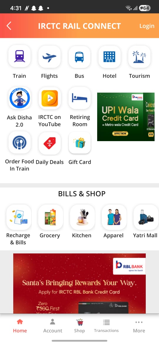
What’s not working in the current app?
Approaching IRCTC Rail Connect as a relatively new user, the experience often felt overwhelming and harder than it needed to be. From walkthroughs, reviews and conversations with frequent travellers, these issues surfaced repeatedly.
IRCTC Rail Connect supports a lot of features, but the way they are presented makes the core journey of booking and managing train travel harder than it needs to be. From my walkthrough, these issues stood out the most:
Summary – Pain points mapped to impact
Detailed breakdown
Problem – key pain points
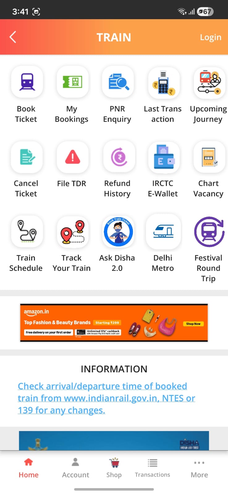
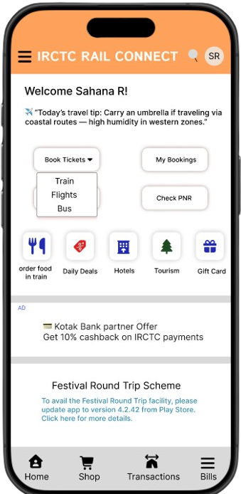
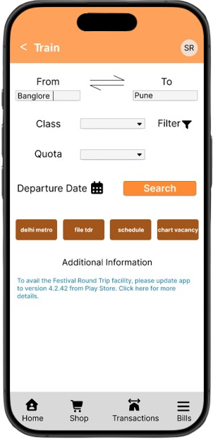
- Core task is hidden behind an extra step. The main reason people open the app is to book a train ticket, but that action is tucked under a generic “Train” option instead of being surfaced directly on the home screen.
- Flights and buses are over-emphasised. Flights and buses are secondary use cases, yet they visually compete with train booking instead of being treated as supporting options.
- Ads grab attention before ticket booking. A promotional banner appears before any ticket-booking option, pulling focus away from the primary task and disrupting the flow.
- Too many top-level options before scrolling. There are 13+ tappable options visible before scrolling. Items like YouTube or Gift Card feel irrelevant in that moment and add to cognitive overload.
- Order food is mixed with unrelated categories. “Order food in train” sits alongside flights and buses, even though it naturally belongs with train-related utilities and services.
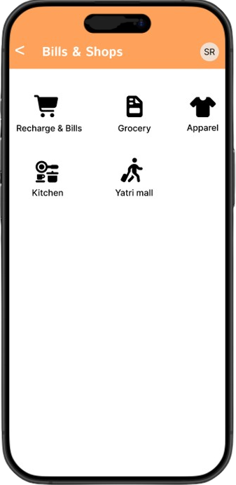
- Bills & Shop feels out of place. The Bills & Shop section feels like a separate mini-app inside IRCTC, with little connection to the core journey of planning and managing train travel.
Impact on users
- Users spend extra time just deciding where to tap first.
- New or low-tech users feel overwhelmed and unsure of the flow.
- Routine actions like booking, checking PNR or live status feel heavier than they should.
- The app feels functional but not very focused on helping users complete their main task quickly.
Goals for the redesign
- Make train ticket booking the clear hero action of the app.
- Give secondary services (flights, buses) less visual weight.
- Reduce cognitive load by grouping and reordering content.
- Modernise the UI without losing the “official, trustworthy” feeling of a government product.
- Add subtle personalisation so the experience feels more like a companion than a static portal.
How I approached this redesign
As a self-initiated project, I used a simple, iterative process centred around quick exploration, visual refinement and documenting key decisions.
What I chose to redesign
Scope
This is a concept redesign focused on improving the core experience, not rebuilding every IRCTC feature. I focused on:
- Home screen (dashboard & primary actions)
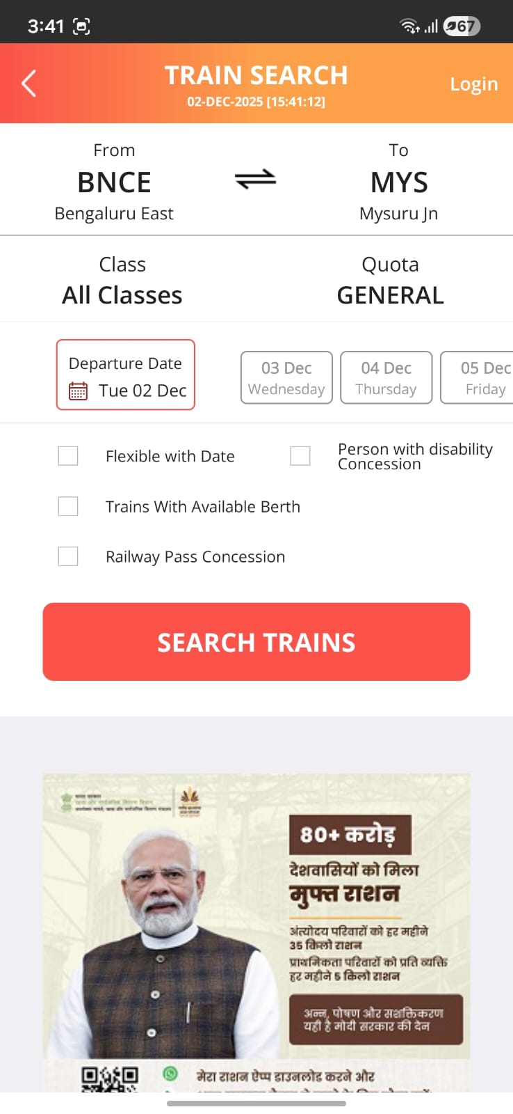
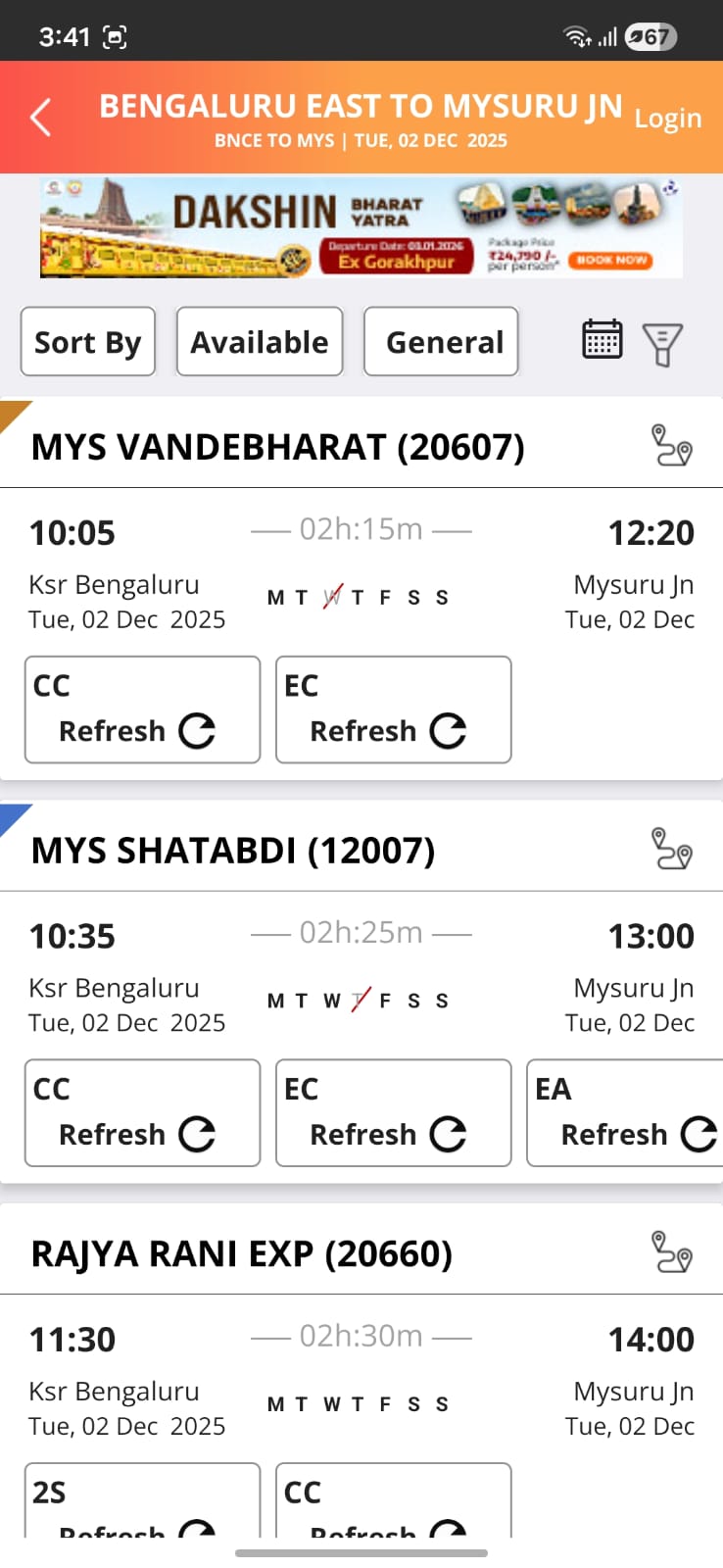
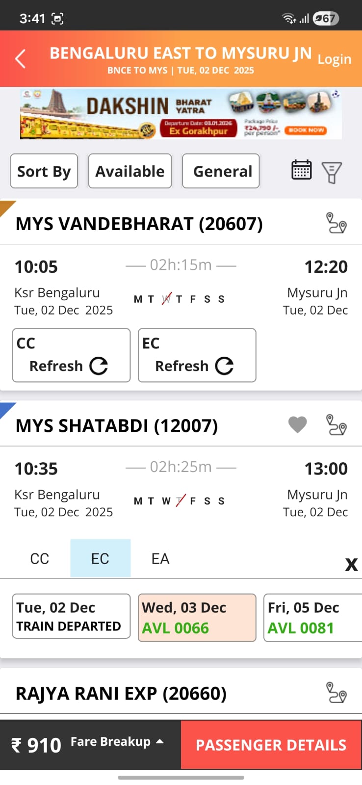
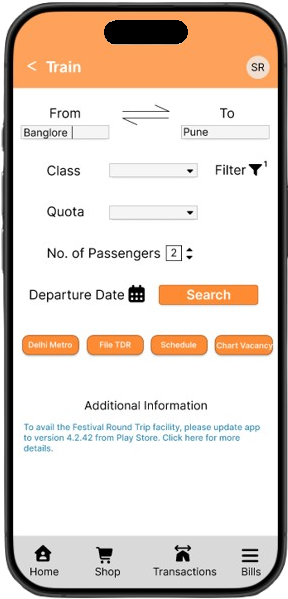
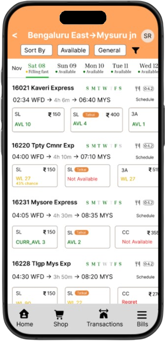
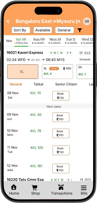
- Train search & results screens
- Bills & Shops and Transactions overview
- Login & profile header patterns
- Bottom navigation & utilities (chips on Train screen)
All back-end logic, rules and policies from IRCTC stay the same. The redesign focuses only on UX and UI.
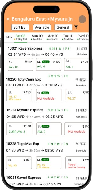
Updated primary flow
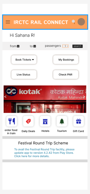
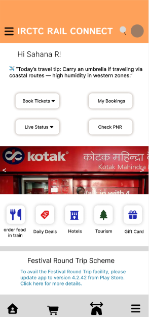
Lo-fi wireframes & early explorations
Designing a calmer bridge, not a brand-new app
Before committing to any visual style, I explored low-fidelity layouts for the home screen, train search and results. The goal was to surface the primary “Book ticket” flow clearly while still keeping secondary services discoverable.
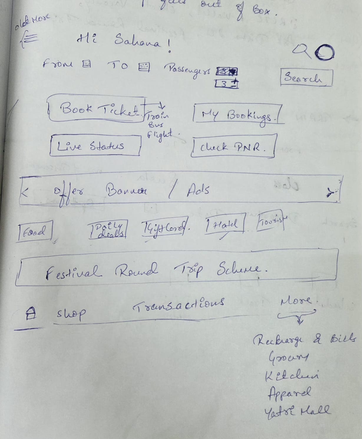
Home screen process
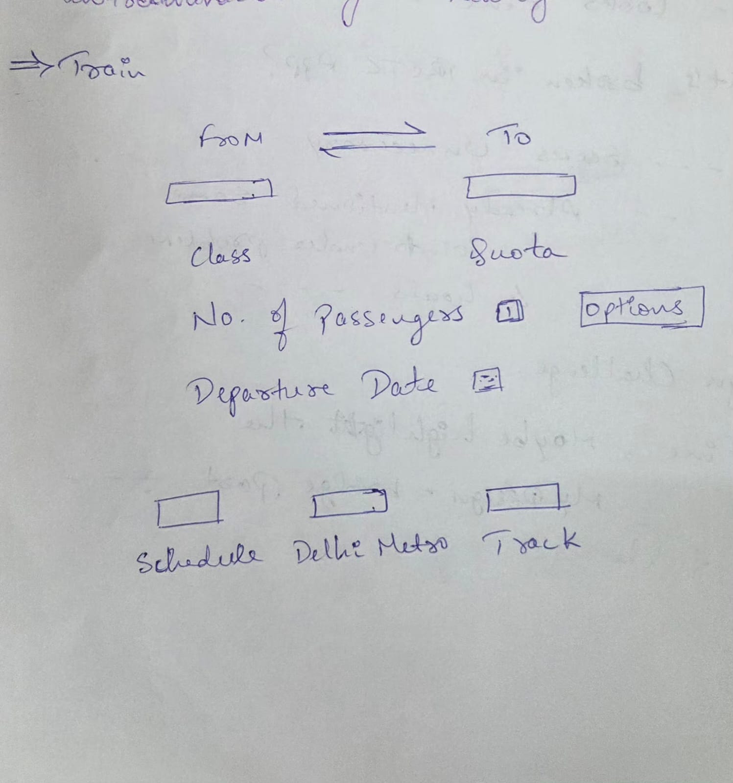
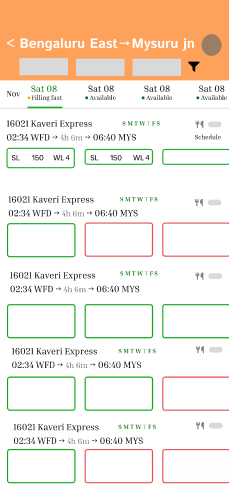
Current train search flow
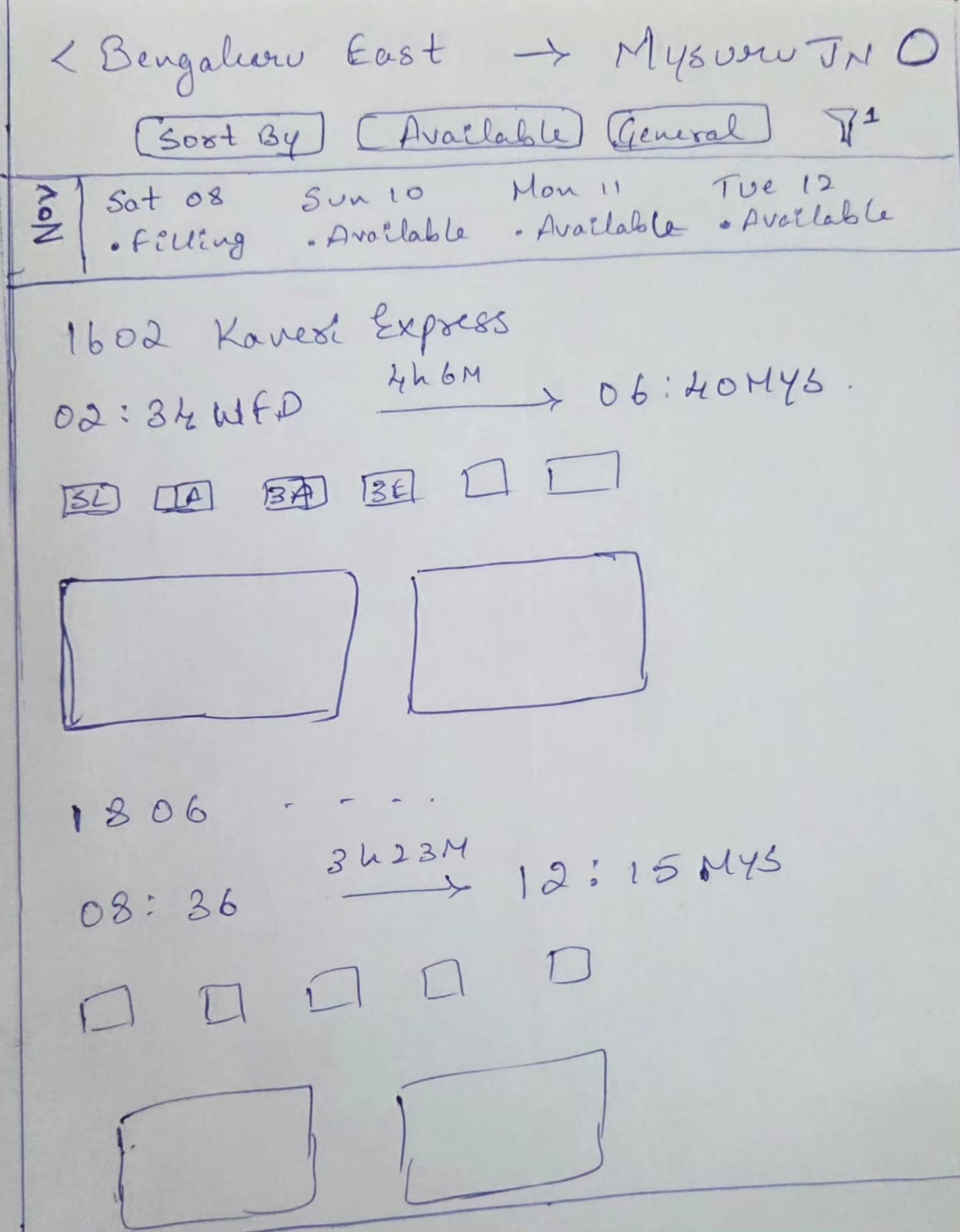
New train flow process
What didn’t work (brain fogs, wireframes & discarded ideas)
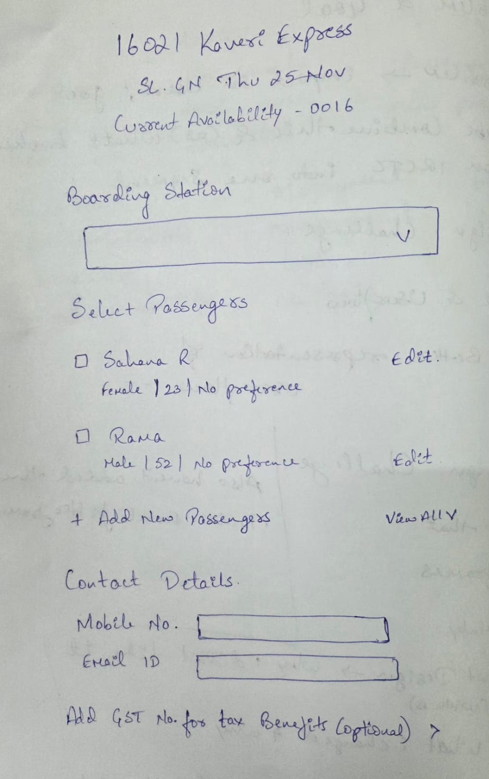
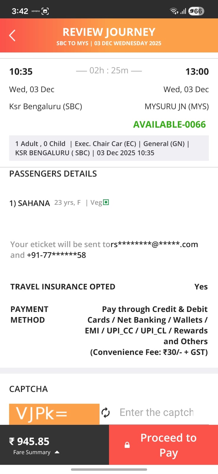
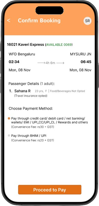
Checkout & payment
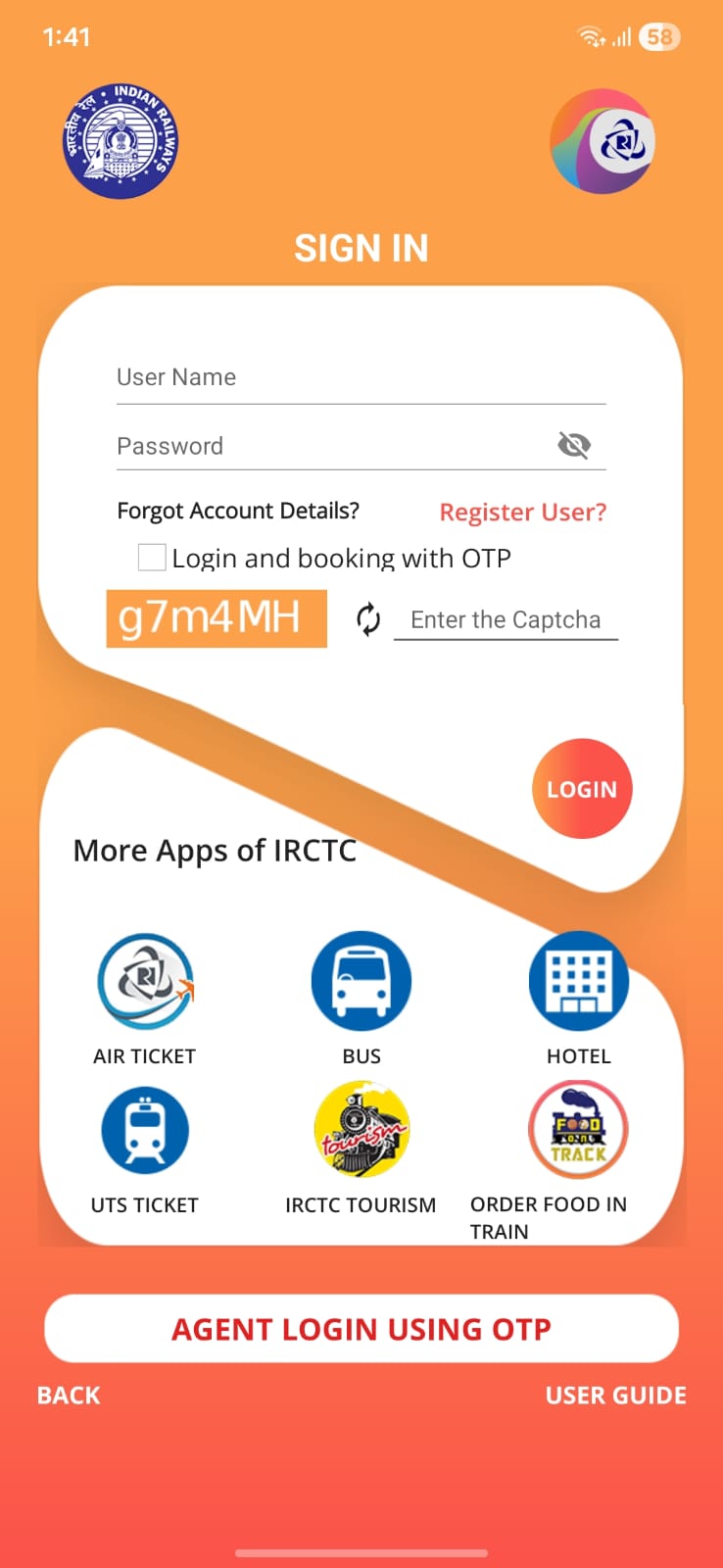
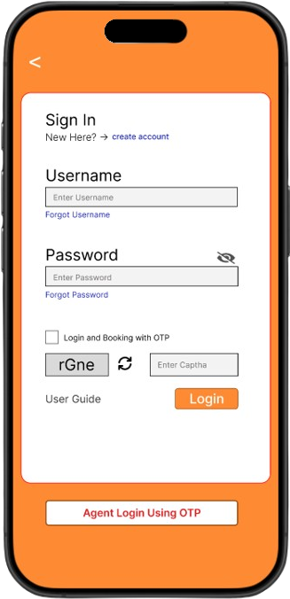
Login
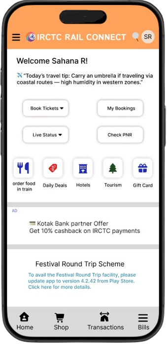
What the redesigned experience looks like
Key screens
UI Kit & Visual Language
Color System
#FFFFFF
60% Usage
#FE8B34 (81% optional)
30% Usage
#A3561B
Depth & Contrast
#F3F3F3
#000000
Primary Buttons
Typography Scale
| Style | Typeface | Size | Weight | Usage |
|---|---|---|---|---|
| Hero / Display | Inter | 22px | Bold | Train names, key screen titles |
| Heading 1 | Inter | 20px | Medium | Page & major section headers |
| Heading 2 | Inter | 18px | Medium | Form titles, sub-section headers |
| Body | Inter | 15px | Regular | Main interface text, passenger names |
| Body Small | Inter | 14px | Medium | Tips, supporting labels |
| Caption | Inter | 13px | Regular | Notes, disclaimers |
| Micro | Inter | 12px | Medium | Chip text, dropdown items |
If this went live, and what I learnt
Potential impact (if implemented)
- Faster access to core train-related tasks from the home screen.
- Reduced cognitive load through clearer grouping and hierarchy.
- A more modern, trustworthy perception of the IRCTC app.
- Better scalability for future services inside the same structure.
Personal learnings
- Redesigning a government app is more about trust and clarity than flashy visuals.
- Sometimes a redesign is a bridge – you don’t have to solve everything at once to make the experience noticeably better.
- Writing the case study while designing forces more intentional decisions instead of “aesthetic” ones.